How an "Ugly" Flyer Generated €12,000 While the Beautiful One Failed
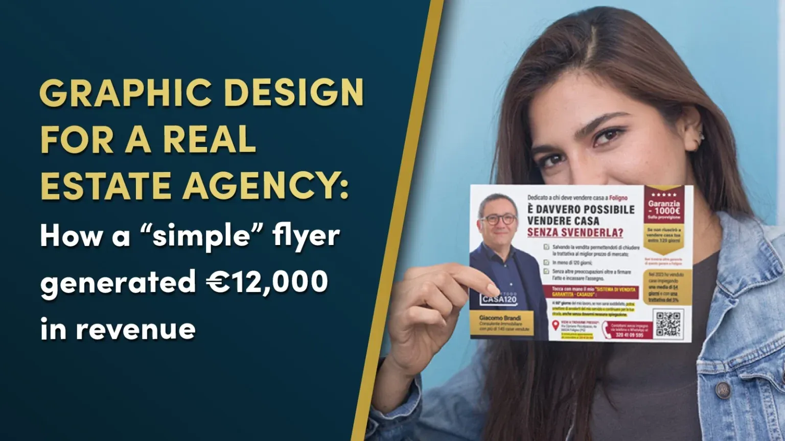
This flyer isn’t winning design awards. But it generated €12,000 in commissions while the “beautiful” version sat in trash cans.
If you write to persuade, you know the frustration: you write a strong sales argument, hand it to a designer, and what comes back looks like it belongs in a museum—but converts like a brick.
This is the story of how we broke that pattern for Giacomo Brandi, a 20-year veteran real estate agent in Italy. Not by making it “prettier.” By engineering it to do one job: get your copy read all the way to the call to action.
The “Beautiful” Competitor That Nobody Called
Before we show you what worked, here’s what didn’t.

This is the kind of flyer most real estate agents use. Clean. Professional. Aesthetically perfect.
And completely useless.
Why it fails everytime:
- The giant hero image dominates 70% of the real estate
- Your eye hits the photo, recognizes “this is an ad,” and the brain shuts off
- The copy is generic and doesnt talk to the reader
- There’s nowhere for the eye to go after the initial impression
- No visual path guiding the prospect to the CTA
The designer did their job—it looks great. But the copywriter’s message never had a chance.
What We Did Differently: Three Visual Principles That Amplified The Copy
Giacomo’s flyer breaks every “modern design” rule. And that’s exactly why it worked.
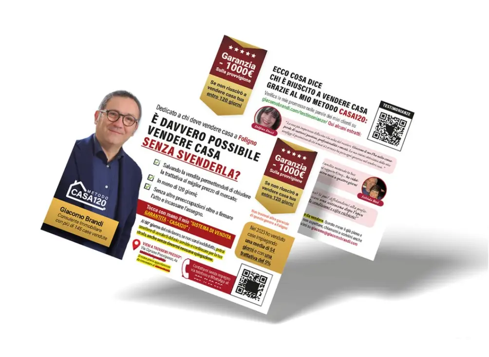
1. Visual Gravity Law
Most flyers are flat. Your eye lands somewhere and stops.
In Giacomo’s piece, every element pulls the eye downward through the copy. The headline hooks attention. The layout prevents the eye from sliding off. Each visual element pushes you to the next line. The photo isn’t the destination—it’s part of the journey toward the offer.
For copywriters: Your argument flows uninterrupted from problem to solution to call-to-action.
2. Information Density
Here’s where “creative” designers fail copywriters: they’re terrified of text.
“People don’t read,” they say. “Keep it minimal.”
Bullshit. People read what interests them.
Giacomo’s flyer is text-heavy by modern standards. We gave the copy room to make a complete argument: problem identification, credibility markers, benefit stack, social proof, clear next step.
For copywriters: Your persuasive argument needs space to develop. This layout gave your words the real estate they deserved.
3. Functional Humanity
Yes, Giacomo’s face is on the flyer. But it’s not the star.
The photo appears AFTER the headline hooks interest. It’s sized to build trust, not showcase ego. It functions as a credibility seal while you read the offer.
For copywriters: Your words do the selling. The photo does the trust-building.
What a “Normal” Designer Would Have Done
Let’s be honest: a designer trained in aesthetics, not response, would have made the photo gigantic, cut your copy in half, added excessive white space, and structured the layout to win awards, not phone calls.
Result: Your sales argument gets visually sabotaged before it reaches a single prospect.
The Results
What happened:
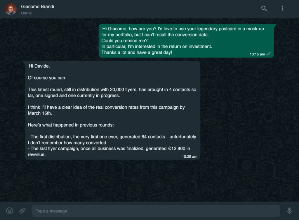
- 4 property owners called
- 1 signed an exclusive listing contract
- 1 additional lead in advanced negotiation
- €12,000+ in estimated commissions
Not because the flyer was “magical.” Because it guided the eye through the sales argument without resistance.
The copy worked because the design didn’t sabotage it.
Stop Letting Beautiful Design Kill Your Copy
Here’s the truth most copywriters learn the hard way:
You can write the strongest sales letter in the world. But if the layout screams “ad,” breaks the visual flow, or buries your call-to-action under a giant stock photo, your prospect never makes it to the close.
Giacomo didn’t get €12,000 in results because he’s “lucky” or because his market is easy. He got results because we stopped treating his flyer like a brochure and started treating it like a sales tool engineered to convert.
Work With Someone Who Treats Your Words Like They Matter
I don’t do “creative” design for everyone. I work exclusively with copywriters and direct response professionals who measure success in conversions, not compliments.
If you’re tired of watching beautiful layouts generate ugly response rates, it’s time for a different approach.
I’m accepting a limited number of projects this quarter.
Leggi questo caso studio in italiano: versione italiana →